Ease Recovery Group
Treatment Brand Development
A new drug recovery center had a vision for a more effective approach to addiction treatment. They wanted a brand identity that captures the holistic nature of their method.
Challenge
Prior to hiring us, our client went through several attempts by different design studios but not one could deliver on the depth of the brand’s promise. Highly skeptical, he agreed to give us a shot.
Solution
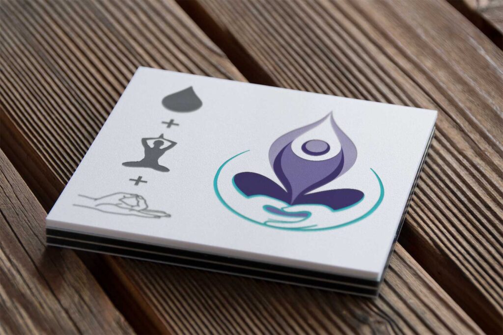
We went on a search for symbols representing the main elements of the treatment center’s philosophy and found a way to blend them all in a cohesive visual solution.
Results
Our solution offered the depth of rational interpretations and aesthetics the previous attempts were lacking. The new visual identity system reinforced the concept of the intricate connections and balances between the physical and emotional well-being of our client’s patients.
Client: Ease Recovery Group
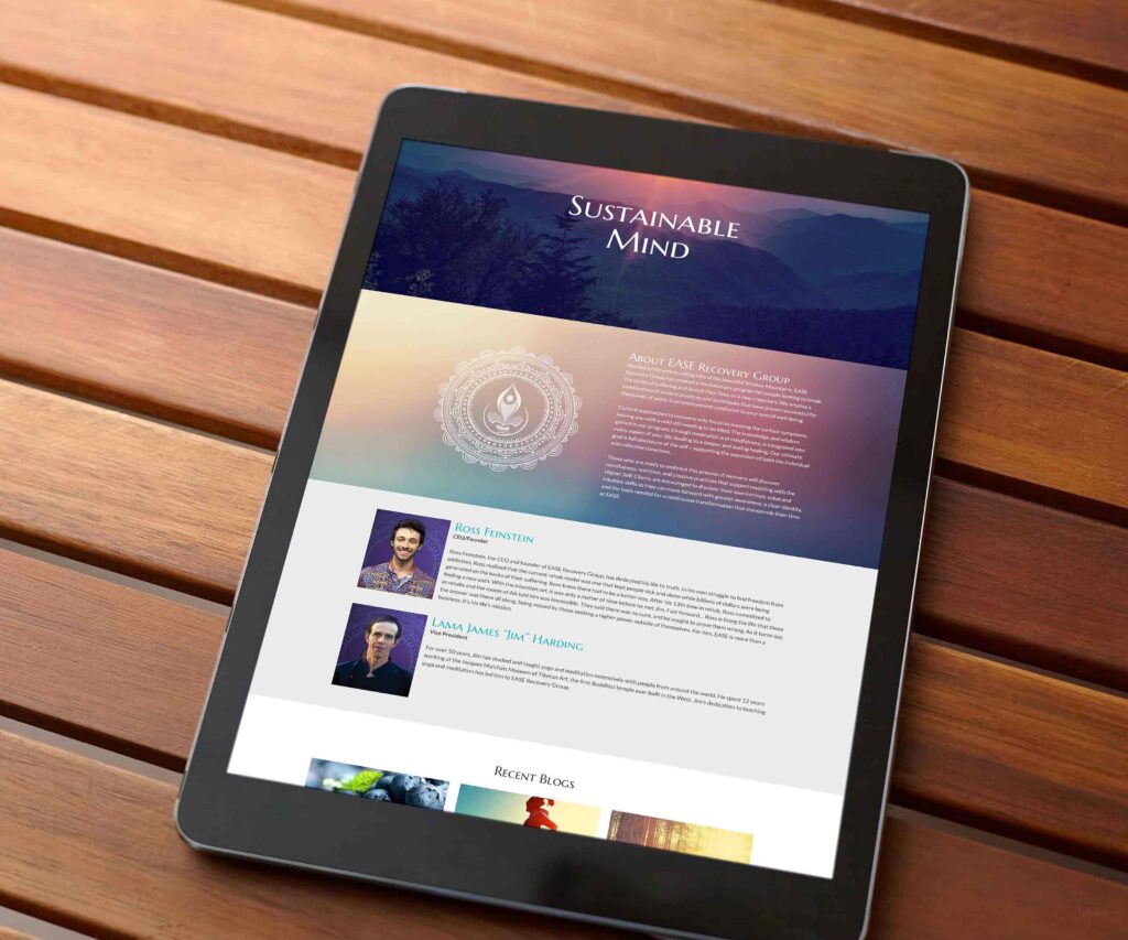
Media: Website, Business Collateral
